Intouch – Product Detail

Play Experience

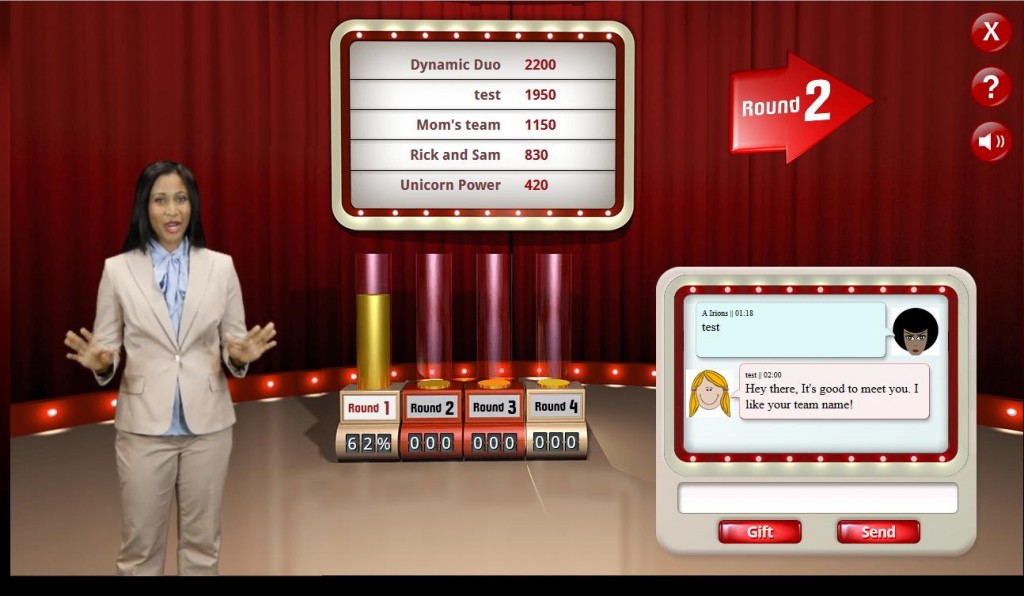
  1. A birth and a foster parent are paired in a team.
  2. They watch videos of dramatic parent-child moments (e.g. tantrum in a parking lot)
  3. They imagine reasons for the behaviors.
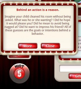
  4. They must guess the answer given by “The Panel,” a group of experienced foster parent

Technical Features

  • Works on a variety of screen sizes (no separate site for tablets, PCs)
  • Multi-layered streaming video with extremely low latency, alpha cutouts, and complex caching
  • Multiple audio streams including effects, music, narration
  • Real-time text chat, gifting
  • Multiple visual animation effects
  •  All game events, logic, scoring, etc stored in database

Screenshots:

snap012  snap007    snap011  snap013


This dream where I tried to explain game design to Mick Jagger

In this dream, I was at a work party, at the project’s wealthy patron’s house, with catered fancy food and bigshots from entertainment and technology.  I didn’t know many people, and followed the host around a bit, saying hi to various senior investors and bigshots by the project organizer.  It was OK but I broke away, sat down, ate the salad that had been served at this huge mostly empty table.  I ate quickly, having not much to do, and then sat sipping the water, not sure what to do until the main course came.

This rangy thin elderly guy, familiar looking, came tripping in the front door like he owned the place, kind of restless and looking for fun.   He threw himself down next to me and said “so this is the party eh?” and I realized he was Mick Jagger.  I’m not a huge fan but I felt interested and excited to talk to him.  Mick drank water and told me that he had a small part in this project, had just finished it, and had a free evening before flying home, heard about the party, decided to drop by.  He didn’t look too excited by what he saw, and I expected him to jump up and leave at any second, but he was sincere when asked about me and my role in the project.  I gave him the basics quickly and well: I was a lead interaction designer on a big commercial entertainment software project for a super wealthy patron.  The project was going OK but not great, and I was shouldering a lot of production stress.   He was interested, a bit.

With genuine curiosity, he said “wow, yeah, so you must have every, every polygon in the scene memorized…” waving his hands around a complex imaginary scene.  In that moment I wanted him, a veteran, a master of crafting experiences, live and recorded, to understand, to see how software designers are unlike artists whose works have a timeline.

I imagined him as a songwriter, designing the song, deciding exactly what feeling should occur at each moment in the song. Maybe at time 1:42, the rowdy song goes calm, and the lead vocal and drums deliver an intimate touching point…then at 1:55 a wall of sound breaks over the listener, taking them to an emotional high, and then at 2:04 it gets crazy and dissonant for 3 beats, and so on.

I imagined how my work would look to him.  The most understandable part would be the story, but this is the last part, for me.  The character, the weapons, the setting, even the backstory, yes. But the story? It’s not the crux of the challenge.

The magic of games is created in dynamic interaction with software. Yes, the interplay between story, architecture, music and character design, are all important parts. But, if those are all successful, the remaining challenge is creating fun systems.  Mechanics, as game designers call them.  Player controls and reactions, second by second, fit and reveal game rules, the larger, slower interactions.  We combine familiar tropes and experiences – WASD controls, powerups, slide-rail levels, tired old puzzles, slot-machine style dramatic chance moments – all those various familiar temporal loops to try for joy, satisfaction, surprise, without frustrating or boring the player.  Chaining together delightful experiences without repeating is tough.

Like an improv play, designing the set is important, but not the crux. It’s designed like fantasyland architecture, like designing a Disneyland or a public park.   The interesting part isn’t the 1870’s Alaska or 3934 Mars: it’s solving the architectural puzzle: create distant attractions so players move through the space, choose a certain width and friction of the walkways, so players are forced to notice or interact with certain points.  You assemble a few ‘wow’ moments where the line of sight opens up to something gorgeous… but these are not the main part.

In all games except single-player, the other players are the more important and most frustrating design element to work with. It’s like throwing a party – you can dictate every detail of the venue and choose music, lighting, food, knowing none of those define the experience as much as avoid ruining it.  You don’t know who’s coming to the party. Parties are mostly fun when the right people are there – surprising conversations, interesting new perspectives.  In games players rarely have the freedom to surprise each other in those fundamental ways. Most guests play ‘by the rules’, trying for a specific goal of the game (though plenty are pranksters or wanderers, who ruin or miss designers’ beautiful experiences). Designers are expected to make these single-minded guests interact in fun ways, using crude carrots and sticks like treasure hunts for keys for locked gates, scarce resources, and cooperative traps but somewhere, somehow the game must also get out of the way and let the guests create their own experience.

The lack of control, the ‘something from nothing’ – that is the sweet torture of being a multiplayer game designer.

The dream, the party, Keith began to fade as I rose out of sleep thinking all this. My last recollection was Mick, slouched in his chair, sipping water as he watched me struggle to find words.  “The audience always has to surrender to the experience we create, right? Songwriter, filmmakers, or game designer.  But game designers have to surrender to our audience, in a different way.  We kind of surrender to each other.”


Research Methods

[TODO this page is in progress]


  • Commercial behavioral tests of mockups, prototypes, and products (“playtests”)
    • Typical N=2-10, targeted recruiting via friends & family, online services (mechanical Turk, Sermo). Screening and representation via pretest survey. 60-min videoconference, intro-use-discuss. Often blinded (two prototypes per session).
    • Data: spoken language, observed body language, decisions and behaviors during prototype (simulated purchase, voluntary use continuation), visible facial and body emotions
    • Results: Feature/Benefit relationships, SWOT analysis, frequency graphs of use/behaviors/themes, discussion

Why a GAME for good? A response to Keogh’s critique

In his critique of McGonigal’s “Play, don’t Replay!” campaign, Brendan Keogh said: “To the games evangelists, games become hammers and all the world starts to look like a nail.” While his central theme did not build on this point, it served as a starting point for this thought.

Choosing a medium for an intervention is not a simple choice, and should be somewhat iterative.  Any intervention should justify their choice of medium. It is a valid design approach to review the strengths of each available medium.  Only then, should one ask: why a game, and not a billboard, brochure, or elearning style app?

For example, consider two tools to help a 4th grader memorize multiplication tables: a set of flash cards, and a video game. Which one is more expensive to build, risky to design? What benefits would a game really bring, in light of the goal?  Why build a new game when there are many such games already? What significant problem could such a new game bring? Not much, argued math game designer Keith Devlin.

Games are justified when their unique abilities are mapped to the needs of the project.  But how can one decide when that’s the case? One way to start is to review “what can games do?”

Do do so, we must start by identifying an aim. For example we might aim to “improve young people’s capacity for leadership in social justice”.  we might then consider past successes: Games are known to …

You might then imagine other, novel uses of video games:

  • Recruit “typical teens” into your team. Here, we have leaders engaging peers by inviting them to play an online game around the topic. THrough in-game interactions, the two youth build relationships and begin to work together.
  • Create the change you want to see.  The idea here is the game mechanic IS the intervention.

Of course, none of these address the question “what do games do BEST?” but it is an easy way to spark a creative discussion.  If appealing ideas are sparked, the next question can criticize: “Can we achieve those same means via some other media (website, brochure, etc)?”  This will likely involve developing the game concept a beyond a spark of an idea.

(to be continued…)


ToyWorld: immersive toy concept

OK, here is a random ambitious idea for immersive toy. I call it ToyWorld. It is a way to make ANY real-world toy come alive onscreen.

It requires a hardware accessory for a game console or PC. Imagine a plastic breadbox that is a 3D scanner (a motorized turntable, a button, and two USB webcams – COGS maybe $30). A child puts any toy inside and clicks “scan”. The toy model appears fully textured onscreen. Auto-rigging 3D software finds any limbs, puts bones in, so the plastic toy immediately starts running (slithering, flying) around a virtual world.

Child then designs the toy’s character. She clicks one of a few basic AIs: “good / bad / boss / minion.” The toy immediately starts acting like that role (e.g. attacking props, vs throwing them in the air). Child selects one of 4 generic settings: scifi, dinosaurs, barbie-style modern, medieval. A 3D environment with props (trees, buildings, paths) appears, and the toy begins running around the world, acting in character – bad guys recruit minions and take over planets…or castles, etc. Child places basic level items like gold coins, spikes, fences. The toy starts grabbing coins, avoiding spikes, running around fences.

The worlds get better, constantly. provide ever-deeper trees of AI and interactive behavior, using Minecraft’s model of constant updates. Pets appear. Weather. Aliens attack. Fires. Viking ships invade.

Players can share and play with EACH OTHER’s toys. Remotely. Angus can get Shoni’s “bad dinosaur” and stick him in his space world.

OK, it’s kind of ambitious. 🙂

“Dumb Ways to Die” – lessons intervention designers can learn from this smashingly successful campaign

Do you aim to deliver do-good messages in an entertaining medium (e.g. video games, Youtube videos)?   If so, I’m arguing that your campaign’s entertainment value is more important than your actual message.  Not equally important. More important. I feel it is surprisingly hard, expensive, and risky to engage an audience, and surprisingly easy, quick, and safe to deliver a simple message to an engaged audience. Does this sound imbalanced or wrong? See if this example convinces you.

Typical metro rail safety campaigns scold us (“STAY OFF THE TRACKS!!”) or aim to motivate us through fear of personal harm (“You’ll lose your legs if you play on tracks!”). However, one campaign has used a very different approach that achieved exceptional success: “Dumb Ways to Die” (dumbwaystodie.org). Before reading why the designers think this campaign is so successful (http://dumbwaystodie.org/why-dumb-ways-to-die-is-an-award-winning-campaign/), watch the “Dumb ways to die” video and form your own opinion.

What about that video, as an intervention, seemed most innovative to you?   I was first struck by the ironic, slightly mean-spirited concept. My guard was down, because I had never before seen such a snarky tone in any do-good campaign…until the last verse. Then, the catchy music slowed to a dramatic pause. My suspicion rose along with my attention…and yes, the message was finally delivered.  However, they kept it light, and gave me more entertaining elements, so I still liked it overall.  The video may not have been only delivering the stated message* but my point here is about the balance between entertainment and message-delivery: most of the video was purley entertaining. We are all experts at extracting a message embedded in an entertaining experience.  The designers recognize that.

The snarky tone is an example that suggests a broader point:

As intervention producers,  our do-good intention can limit and blind us to the best path to achieving our mission.

There are many barriers to such campaigns. One common barrier are the clients’ willingness to let the ends justify the means. Stakeholders in any important mission have emotional reasons for being involved, and these emotions can prevent a purely logical approach to campaign design.  Let’s say Sam the Metro Rails exec is our client. When a drunk teen is found, bloody and maimed on the rails, Sam may get that call.  To Sam, joking about rail death is tasteless at best. This is no laughing matter.

Stakeholders like Sam that hold the pursestrings want to make an effective campaign, but their design intuition may be exactly wrong.  It is intuitive for such stakeholders to try to scare the public into behavior change.Yet, as this campaign has shown, there are far more effective approaches waiting for us to discover.

For those of us who can overcome their instincts and be logical about their campaign design, I feel there are great gains in effacacy to be had.

End.

————————

References

Examining the Communication Effects of Health Campaigns A Case Study Using Find Thirty Every Day® in Western Australia. Justine E. Leavy, Adrian E. Bauman, Michael Rosenberg, Fiona C. Bull SAGE OpenMay 2014,4(2)DOI: 10.1177/2158244014533557.

* Secondly, the video does not beat a dead horse.  Everyone already knows playing on railroad tracks is dangerous.  Instead of aiming to remind us of something we know, this campaign adds a new reason not to play on the tracks: peer pressure.  The video makes risky rail behaviors (standing too near the edge of the train platform) as absurdly stupid-sounding as taking your helmet off in outer space.  By laughing at the squished cartoon guy on the tracks, we accept that being unsafe around trains would make people laugh at us for choosing such a dumb way to die. The fear of social scorn is a tremendously powerful deterrent, especially for teens (http://www.tandfonline.com/doi/pdf/10.1080/08870449908410754).  When tempted to put a coin on the tracks, we choose not to, because we picture our friends thinking we’re a dummy, not losing fingers.


http://www.academia.edu/4174420/Attention_and_Rhetoric_Prolepsis_and_the_Problem_of_Meaning

Three FAQs for Juicy Game Design

What is juicy design?  The general idea is expressed poetically here: “the satisfying feeling we get when potential energy is converted to kinetic energy. That point where we release energy from a design in a way that creates surprise, delight,…”

Most hit casual games are loaded with examples, but Popcap’s games are most commonly cited, with good reason. Plants vs Zombies, Peggle, and earlier games all are amazing tutorials on making tiny actions, whose meaning is vanishingly small, satisfying and building holistic player satisfaction.

Let’s discuss the concrete implications (aimed at the beginning game designer, as a FAQ).

Q: How is Juicy different from basic good software interface design practice?

A: Most designers are comfortable with logical or factual design lenses: e.g. a “click” sound helps the user realize they clicked a button. Simplify  the screen so the important ideas pop out. These make sense.   By contrast, Juiciness is not as logical. Juiciness is an emotional lens on design.  A well-designed juicy game matches the players subconscious feelings of fairness and reward/punishment “I did that well, so something good should happen.”

Q: So, Juicy means good reward / punishment, Skinner Box type game design?
A: No.  Juicy is about tiny player action.  When you collect a coin in Plants vs Zombies, after doing a successful move, notice your FEELING of expectation of “good stuff”.  Notice the satisfaction of the coin appearing. Then, before you click, imagine the coin just vanishing when you clicked it.  Now, click it. That little flash and spinning of the coin, traveling to your points? That’s juiciness. It’s all the small stuff.

Q: So, Add fancy animation and your game is juicy?
A: Maybe.  A poorly-design juicy game has fancy animations that don’t relate to the player’s experience. It will feel ‘tacked on’, or unrelated to the core game activity.  Or, it’s overdone: Imagine audience cheering sounds for every tiny decision. It is too much – it feels false.

Q: Does juicy relate to the big picture – the game’s purpose – or is it more about UI in the moment?
A: It’s both, in a gluey way. Good juicy features connect the moment to the big picture. reward system.  When user intention is responsive and satisfyingly reflected back by the game.

Q: Is a Juicy design approach better than other ways of designing games?
A: No. “Juicy” is merely a narrow but useful lens to view a game’s design.  One cannot simply “make a game juicy” and be certain it’s better.  For example, consider characters in a casual game.  A mascot game character, like the Bookworm worm, reacts to player choices and personified game outcomes. The worm’s primary function is to mirror and validate the player’s internal, emotional state (though it also provides hints).  This is “juicy” character design.

Now consider the player character in a serious first-person immersive war simulation game.    Can the enemy see the player’s head above the barrel?  This is not an emotional, “juicy” design decision. This is a rational design issue.  The player’s character is highly functional: its shows the player’s position in the field, the action the player chose, and the reaction or impact.

The primary purpose of most 3D game player characters is not to reflect the player’s emotional state (though it is part of the purpose – for a richer discussion see Gee). Imagine “improving” the game by having player character thinking snarky comments, celebrating head shots or wiping tears away, when the game is primarily strategic.  Hopefully it’s obvious that making this character more “juicy” could easily hurt the player’s overall satisfaction.

Your comments or critiques are welcome.

Wanted: Better Labeling for Health Apps in App Stores

Health apps (including games for health) are being used today by consumers and medical professional to treat diagnosable health problems.  They are currently unregulated, though the FDA this month announced the first round of regulation.

The FDA has specifically said they are not aiming at app stores (link).  However, there is clear need for improvement in today’s app stores.

Consumers should know if the health app they’re buying is effective, but today, there is no such information available.

The design of app stores (e.g. Google Play, Apple App Store) strongly influences the information developers disclose.  Right now, there are no guidelines for health app developers.  They are required to supply the same information as entertainment app developers.

I feel the health app community – mHealth, Games for Health, FDA, academics, and consumer advocacy organizations should band together to produce or endorse a single set of design guidelines. These guidelines are aimed at Google, Apple, insurance agencies, and other leading distributors of health apps to consumers.

App stores are the isle in the drugstore.  They are where consumers shop and compare.  Like the labels on over-the-counter medicine, developers of health apps should inform their consumers:

– what does this app aim to achieve? (reduce depression? weight loss? injury rehabilitation?)
– is the app effective? (an independent, 5-star rating from “promising” to “proven”)
– who is the app intended for? (age, condition)
– what are signs that further help is needed, and where can the user find that help?

I feel that, given the state of affairs, voluntary guidelines strike a good balance between overregulation and the total consuiosn in today’s app stores.

If you agree or have comments, please add a comment below or get in touch directly: josh@whit-kin.com

Useful Theory for Learning Game Designers: Core Mechanic

You’re a learning game designer, looking for ways to explain the basic ideas behind your ideas to stakeholders. You need “greatest hits” theory that’s simple enough to explain to anyone.

Here’s Wolfram‘s great diagram and explanation of the components of a game:

Wolfgang’s 4-layer cake of game design

It obviously doesn’t describe ALL designs, but it’s a great starting points.
http://www.funstormgames.com/blog/2012/06/designing-around-a-core-mechanic/

Gender Contamination: A clear term for a fuzzy but real idea

I love it when someone names and explains a truth I’ve been half-aware of for some time.  This just happened today with the Jill Avery’s term “Gender Contamination”.

This article explains:

“Gender contamination” is the loaded and fascinating term coined by HBS senior lecturer Jill J. Avery to describe just how uncomfortable women and (more often than not) men become when a product they use to symbolize their gender is extended to appeal to another gender. She first noticed this phenomenon while working at Gillette, where the company was careful to call its women’s line “Gillette for Women” in order to create separation between pink razors that smell like papayas and black manly-man razors that smell like manly-man things. This piece describes a couple of other examples stemming from the research, including the struggle to get men to drink diet sodas (black cans and avoidance of the word “diet” help) and how gents on Porsche message boards managed their insecurities when the car company came out with an SUV.

It’s a really cool idea.

I’ve observed one particular instance of Gender Contamination that I found interesting. This phenomenon is sort of a variation on the idea above.  It happened in 3 steps:

  1. A product started gender-neutral,
  2. It became dominated one gender (by accident or design) and
  3. now is being marketed explicitly to another gender.

I’m thinking of Lego. Legos used to be mean generic, gender-neutral building blocks. Then came themed kits, which was a key reason Lego is the second largest toymaker in the world.  By selling kits, instead of bulk blocks, Lego can differentiate and market an endless series of products.  This is especially important because Lego’s patents recently expired.

Here’s where the gender contamination idea comes in.  Lego’s history of gender-neutral themes did not continue with their kids.  A few kit themes are gender-neutral today (e.g. Lego City) but most are not. Lego has found huge commercial success in making kits themed and licensed around boy-friendly storyworlds (Star Wars, Indiana Jones, Iron Man, Batman). Lego has churned out many original storyworlds around action and violence (e.g. Chima).

The sad result is many, even most, girls today don’t play with Legos after Duplo.  Lego became a boy’s toy.

Now, Lego’s trying to fix that.  They’ve recently launged a girl-targeted storyworld called Friends series.

Maybe it’s just because it’s new, or because I’m a guy, but to me, Friends feels …weird… even though I’m not opposed to Lego’s intent.  In fact I think it’s great that Lego is reaching out across gender boundaries, even if their motives are impure.

What’s wrong with Lego Friends?  It’s certainly got some clear weaknesses, as amazing game designer Erin Robinson explained so powerfully (here).

However, I feel something else uncomfortable about Lego Friends, and I can’t explain it. I wonder if Brand Contamination theory (or this minor variant of it) might be part of the key to articulating that other nagging feeling.

I’d love to hear Jill and Erin discuss how the idea of Gender Contamination explain the Mysterious Discomfort of Lego Friends.  Here’s hoping they’re inspired to explore it together.